Coinciding with the 30th anniversary of Pringles being launched in the UK, the moustachioed face of Mr P mascot adopts a new, emoji-style look.
Whilst retaining the iconic look and feel, the most noticeable changes to the logo are Mr. P’s hair loss, expressive eyebrows and oversized red bow tie. The wordmark has also been redesigned, and it is contained within the bow tie lock-up.
Pringles brand design director says ‘the intention with the new look is to simplify and modernise the design, giving the brand’s mascot a bold makeover’.
The redesign fully embraces the recent flat design trend, which priorities 2D illustrations, bright colours and a simplified/minimalistic look. This makes the logo much cleaner, translating better in the digital world.
Link to source >>
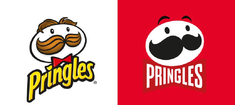
Image credit: Pringles