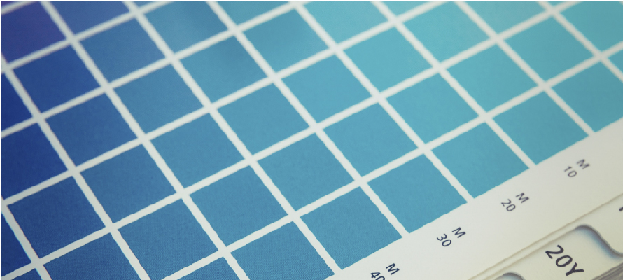
Pantone partnered with Charity:Water and launched a campaign to highlight the fact that 1 in 10 people are living without access to clean and safe water. The colors were inspired by drinking water found in communities around the world.
From neon green to vaguely maroon to classic beige, Pantone claim that they’ve seen dirty water in every shade imaginable–and never want to see someone drink it again.
Every year, Pantone exercises its position as the reigning authority in color communication to crown the official color of the year. Now, the brand is applying its expertise to identify a new, critical selection of tones: the colors of water insecurity. This campaign allows Pantone to make a sustainability impact, while communicating its brand position.