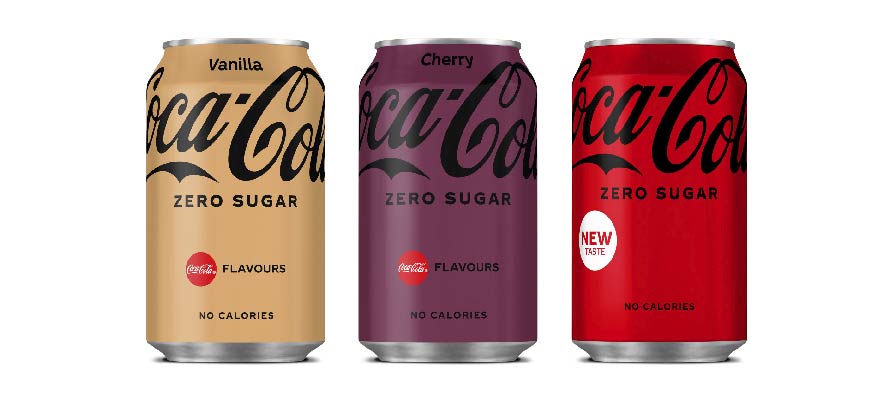
Coca-Cola has redesigned the packaging of its flavoured products and their zero-sugar counterparts. Senior brand manager of Coke Choice Portfolio, Natalia Suarez says – ‘We wanted to modernise and simplify the look of our packaging to help consumers find the flavour they’re looking for through a colourful but clean design’.
Full-colour cans correspond to single flavours, while stacked colours communicate dual flavours. In addition, full-sugar drinks will have a bold Coca-Cola logo in white while zero-sugar drinks will have the logo in black.
While the new designs are consistent in terms of placement of the iconic logo, many have pointed out that the choice of colours has led to some legibility issues. Cherry Coke, for example, features a black logo on a dark purple background, and vanilla Coke is white-on-gold.